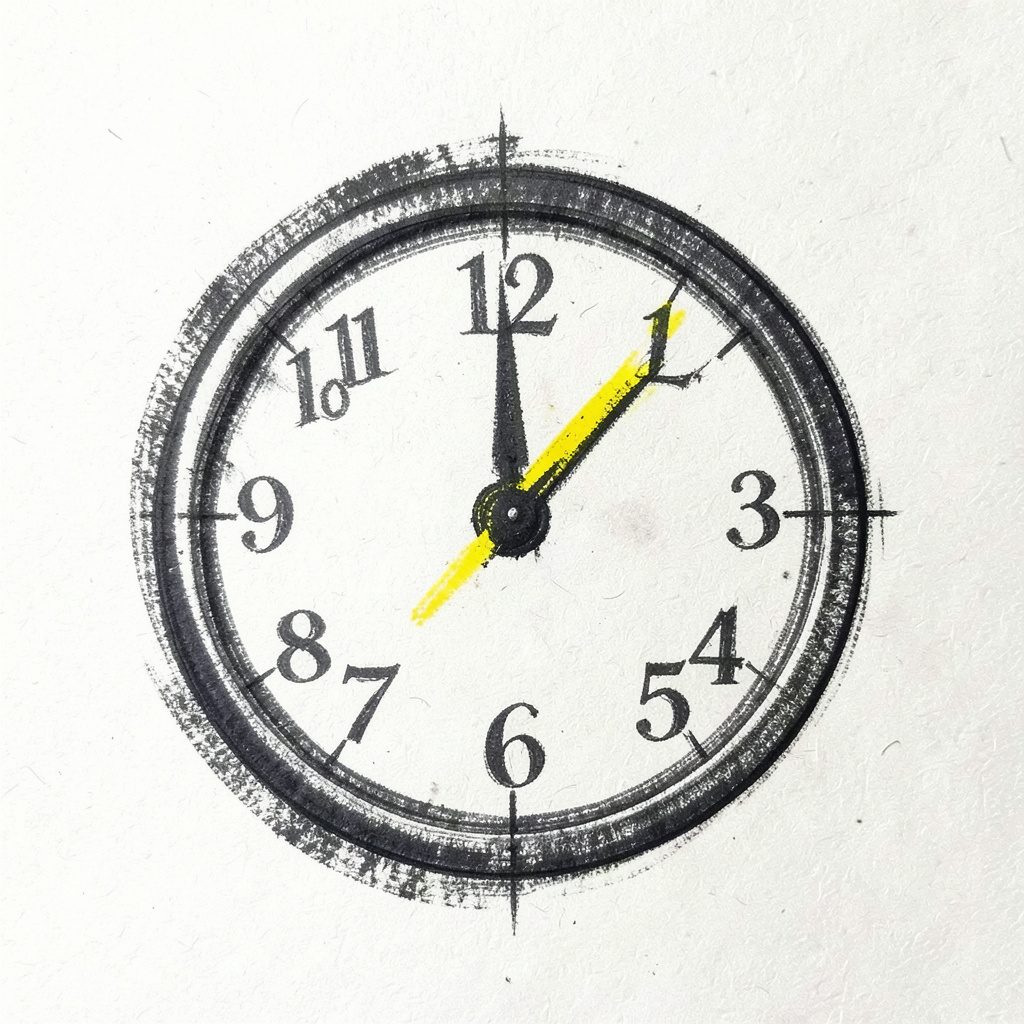
Weebly Tricks #84 — ClassyCountdown Timer
Add a clean countdown timer to your Weebly site, created by Marius Stanciu.
Learn how to customize and modify your Weebly site with new effects, plugins, and widgets.
Welcome to My Weebly Tricks, a resource for Weebly site owners who want to go beyond the basics. Here you'll find step-by-step guides on adding image effects, slideshows, navigation scripts, text animations, countdown timers, and more — all tailored for the Weebly platform.
Using CSS animations to animate Weebly elements adds movement without changing the underlying content or rebuilding the site. A heading can settle into place, a button can invite a click, and a promotional badge can draw attention at the right moment. Because CSS works with your existing layout, these effects can suit a polished theme or add character to a simple Weebly page.
A Weebly site already provides the structure, imagery and responsive behaviour. Animation simply controls selected visual properties over time. It can reveal a hero message, emphasise a service, or create a gentle repeating cue around a sale. The important distinction is that CSS cannot create genuinely changing content on its own; a timer or counter still needs suitable code or a widget.
Good motion should clarify hierarchy rather than compete for attention. Short entrances make a page feel responsive, while a single repeating effect can signal urgency. Before adding motion, decide what the visitor should notice first. That keeps the custom CSS focused and prevents a simple Weebly site from becoming visually noisy.
CSS animation changes computed style values over a defined period. Weebly themes determine where elements sit, while custom CSS decides how they move. Unlike a transition, which reacts when a state changes, an animation can begin as soon as the page loads. That makes it useful for hero copy, section reveals and timed attention cues.
@keyframes soft-rise {
  from {
    opacity: 0;
    transform: translateY(18px);
  }
  to {
    opacity: 1;
    transform: translateY(0);
  }
}

.hero-copy {
  animation: soft-rise 700ms ease-out both;
}
The keyframes define the start and end states, and the animation property connects them to a selector. In this example, opacity fades the copy from invisible to visible while translateY lifts it by 18 pixels. The 700-millisecond duration keeps the entrance brief, ease-out creates gentle deceleration, and both applies the starting state before the animation begins and retains the ending state afterwards.
Add these rules through the custom CSS or code-injection area available in your Weebly editor. If your plan exposes only an HTML embed, the same <style> block can sit inside that embed. Test on the published page, because editor previews and responsive mobile views can hide overflow or timing differences.
Choose selectors that identify one intended element, not every heading or paragraph on the site. Use the browser developer tools to inspect a Weebly block, then favour a stable class over a generated layout ID where possible. Names such as .hero-copy, .menu-card and .sale-timer are clearer than generic rules and easier to revise when the theme changes.
.menu-card--first {
  animation-delay: 0ms;
}

.menu-card--second {
  animation-delay: 120ms;
}

.menu-card--third {
  animation-delay: 240ms;
}
Timing controls how quickly the effect begins and finishes. Short delays create a staged reveal, but long waits can make visitors think a page is broken. On a Melbourne laneway café site, for example, three menu cards might appear in sequence as the page settles, helping the eye move from the main dish to its price and details.
Keep the stagger close together, perhaps 100 to 150 milliseconds between items, and apply it only to siblings that are intended to move together. Test the delay at both desktop and mobile widths. If content appears late, shorten the duration before removing the entrance entirely.
Entrance effects answer a simple brief: what should appear first? A fade works for long headings, a vertical slide suits content moving into view, and a slight scale change works for compact feature cards. Avoid combining every effect in one selector, because each new movement competes with the next.
@keyframes gentle-pop {
  0% {
    opacity: 0;
    transform: scale(0.96);
  }
  70% {
    opacity: 1;
    transform: scale(1.02);
  }
  100% {
    opacity: 1;
    transform: scale(1);
  }
}
Prefer opacity and transform because browsers can usually handle them more efficiently than changes to width, height or position. Keep the final scale at one and set transform-origin when a card should grow from its centre. The animation should end in the same visual state as the normal page, not leave a heading slightly displaced.
Seasonal campaigns offer a useful timing cue. For Australian businesses, content tied to Australia Day, ANZAC Day or the end of the financial year can receive a restrained reveal when the section appears. Use a timed class for a page-load entrance or Weebly’s built-in scroll effects; plain CSS does not detect when an element enters the viewport. Keep the motion respectful: save dramatic transitions for celebratory campaign pages, while remembrance-related material remains calm and direct.
Countdown timers and stock signals often seem to need constant movement, yet CSS only controls appearance. A timer still needs JavaScript, a plugin or a Weebly widget to update its numbers. CSS can then give that live element a subtle pulse, draw the eye to an offer, or visually connect it to a matching badge.
For a practical starting point, the classy countdown timer guide shows how a timer can be added to a Weebly page. Pair it with a simple keyframe rather than animating every digit separately, which can create a nervous jitter. The following rule gives the whole timer one controlled pulse.
@keyframes timer-pulse {
  50% {
    transform: scale(1.04);
  }
}

.sale-timer {
  animation: timer-pulse 1.8s ease-in-out infinite;
}
Stock wording needs care: animate a “limited stock” badge only when the claim is accurate. A Brisbane seller at New Farm Markets can use a gentle pulse on a genuine event reminder, while the product details remain static and readable. Include the urgency in text as well as motion, since some visitors will arrive with reduced-motion settings enabled.
Hover feedback gives visitors an immediate sign that a button, card or link is interactive. A small upward movement and a soft shadow often feel more useful than a colour change alone. Apply the effect to the actual clickable element, not a wrapper that also contains unrelated text.
.cta-button {
  transition: transform 180ms ease, box-shadow 180ms ease;
}

.cta-button:hover,
.cta-button:focus-visible {
  transform: translateY(-2px);
  box-shadow: 0 8px 18px rgba(0, 0, 0, 0.16);
}
Transitions are usually better for hover feedback because they run only while the pointer or keyboard focus is active. Pair them with a visible :focus style, and remember that a phone has no hover state. On touch screens, the effect can occur when a finger lands, but it should never be the only clue that a control works.
Consistency matters when several Weebly elements share motion. If one button rises by two pixels, another image rotates twelve degrees and a third flashes, the site feels assembled from unrelated tricks. Choose a shared duration and easing curve for related controls, then reserve a different treatment for content that truly needs emphasis.
Mobile-first motion matters across Australian use cases. An online-radio property such as Radio Online Murcia offers a useful reference for testing how a recognisable identity remains legible on a small screen. A Sydney café whose customers browse menus on the ferry also needs controls that respond immediately to a thumb, not decorative motion that delays the next action.
A Perth supplier serving customers across regional Western Australia needs a page that loads cleanly over variable mobile connections. Animation should never delay access to a phone number, booking form or product price. Keep effects proportional to the screen: a 40-pixel rise can feel polished on a desktop but excessive on a narrow phone, so build distance with relative units and shorten the duration in a media query.
@media (max-width: 600px) {
  .hero-copy {
    animation-duration: 450ms;
  }
}
An Adelaide Central Market stall can use a compact product reveal on a phone without turning the whole page into a miniature desktop layout. The best mobile effect is often the least noticeable one: content that appears promptly, text that stays crisp and enough open space for a thumb. Keep large motion for full-screen campaign sections rather than every small card.
Test each effect in a browser developer console and on real devices, not only in the Weebly preview. Check current versions of Chrome, Safari, Edge and Firefox, then repeat on both iOS and Android. A timing that feels smooth on a desktop can expose overflow on a compact phone or disappear behind a sticky header.
Reduced-motion preferences deserve special attention. The following rule removes the example entrance and hover motion while leaving the content visible and usable. Preview it with the operating system setting enabled, and keep any essential meaning available in static text rather than movement alone.
@media (prefers-reduced-motion: reduce) {
  .hero-copy,
  .menu-card,
  .sale-timer {
    animation: none !important;
  }

  .cta-button {
    transition: none !important;
  }
}
Performance matters because animation runs over time and can keep a device active. Give priority to transform and opacity, avoid looping several large filters, and stop perpetual effects when they no longer serve the page. Test the published site with the cache cleared, review the browser performance panel and check that motion remains smooth beside Weebly widgets, galleries and embedded maps. Keep custom rules in a copied stylesheet or code snippet so a theme update does not erase them.
Open your Weebly editor now and choose one element that deserves attention, such as a hero heading, a menu card or a genuine event badge. Add a stable class, paste in one keyframe block and preview the result at desktop and mobile widths. Keep the first test deliberately subtle so you can judge its timing and readability.
Publish the page, open it on an iPhone and Android device, and test it with reduced motion enabled. Then add a second effect only if the first supports the visitor journey rather than simply filling space. A single well-timed movement can make a Weebly site feel considered, quick and distinctly yours.
Add a clean countdown timer to your Weebly site, created by Marius Stanciu.

A comparison of free and paid email accounts and the advantages of using a domain-based custom email.

Instructions on setting a free custom email address for your website within Weebly.
Configure your Weebly RSS feed so visitors can subscribe and receive email updates.

Details on a promotional offer for two months of free email hosting from Namecheap.
Subscribe for regular email updates and get access to new Weebly tips and tutorials.